Clipping, Masking and other wonderful CSS shaping properties
Experiments in clipping, masking, constraining elements with Webflow and the custom code widget.
How does it work?
We're using custom CSS code to bring features that aren't yet natively supported by Webflow. Custom code can be placed at many level in a Webflow project: at site level (in the Custom code tab of the site Settings), at Page level (in the page settings) or within the page itself, using the Custom Code Component.
For our experiments, prefer using the Custom Code Component from the Add+ menu. Place it anywhere in the page (it won't be visible). This way, you will see the effects of your custom code right in the Designer, without having to publish most of the time.
The blue box will show the custom code used
The purple box will roughly show the HTML structure of the demo
Default scene
the scene we're going to use for our experiments. It's just a text in a DIV with a bakckground-image.
KILLING
OF A
CHINESE BOOKIE
Don't grab the code in this page, duplicate the site and grab the code in HTML code widgets inside of each example. The code given here is simplified and sometime don't include all the browser variants such as -webkit- variants.
<div background-image="ben.png">
<p>killing of a chinese bookie</p>
</div>
<div background-image="ben.png"><p>killing of a chinese bookie</p></div>
Background Text Clipping
Edit oct 2018: due to a bug in Chrome 69, this technique now use the bg image and the clipping property on the text element. Normally, it's possible to set them on the parent, which brings a way better flexibility.
The clipping property and the background image are set on the text.
KILLING
OF A
CHINESE BOOKIE
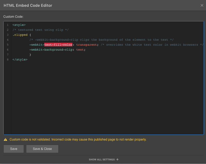
.clipped {
-webkit-text-fill-color: transparent;
background-clip: text; }
Background Text Clipping with Fixed background image
Edit oct 2018: due to a bug in Chrome 69, this technique now use the bg image and the clipping property on the text element. Normally, it's possible to set them on the parent, which brings a way better flexibility.
The clipping property and the background image are set on the text.
KILLING
OF A
CHINESE BOOKIE
.clipped {
-webkit-text-fill-color: transparent;
background-clip: text; }
Background Text Clipping with gradient
Edit oct 2018: due to a bug in Chrome 69, this technique now use the CSS gradient and the clipping property on the text element. Normally, it's possible to set them on the parent, which brings a way better flexibility.
The clipping property and the gradient are set on the text.
KILLING
OF A
CHINESE BOOKIE
.clipped {
background-clip: text;
-webkit-background-clip: text;
text-fill-color: transparent;
-webkit-text-fill-color: transparent;
}
Blending mode
This time, a CSS blending mode is applied to the text element.
As it's a blend mode and not a clipping, we can animate it.
KILLING
OF A
CHINESE BOOKIE
.difference { mix-blend-mode: difference }
<div background-image="ben.png">
<p>killing of a chinese bookie</p>
</div>
Stroke text
The clipping property is given either to the DIV or the text. It affects only the text.
KILLING
OF A
CHINESE BOOKIE
.stroked {
-webkit-text-stroke-width: 1px;
-webkit-text-stroke-color: #d69873;
}
<div background-image="ben.png">
<p>killing of a chinese bookie</p>
</div>
Stroke text + Background Clipping
Edit oct 2018: due to a bug in Chrome 69, this technique doesn't seem to work anymore. The example works because it's been modified.
Text elements gets or inherit the stroke property.
KILLING
OF A
CHINESE BOOKIE
<div class="clipped stroked"></div>
<div background-image="ben.png">
<p>killing of a chinese bookie</p>
</div>
Using an external image as a mask
Link to a SVG polygon, with position (center), size (contain) and repeat (no-repeat) set.
KILLING
OF A
CHINESE BOOKIE
.masked {
mask-image: url(domain.com/image.sv
), none;
mask-size: contain;
mask-repeat: no-repeat;
mask-position: center;
}
<div background-image="ben.png">
<p>killing of a chinese bookie</p>
</div>
Default 3D transform scene
Title is moved forward. Perspective is set at 1000 for all the scene childs. Rotation of the DIV on hover. Transition on the DIV
KILLING
OF A
CHINESE BOOKIE
<div background-image="ben.png">
<p>killing of a chinese bookie</p>
</div>
Constraint an image inside of an element using CSS object-fit
To completely fill an element with an image, or to give an image precise dimensions to fit in, you may be tempted to use the image as a background-image. This will produce the intended result, but it won't be so great in terms of Accessibility and SEO. A background-image solely has decoration purpose and isn't considered as an illustration image that is part of the content (it's not declared in the HTML code, only in the CSS code) and it doens't have a alt text to describe it.
So if you need an image to behave like a background-image with covering options, but stays a HTML image, you can use the CSS property object-fit.
The scene below is a bit different than the base scene, it's not a DIV with an image. And to make the demonstration obvious, background, it's a DIV containing an image. And to make the demonstration obvious, we made the div a square, when the image is a rectangle.

Let's use CSS to make the image fills a square while being an image and not a background-image.
We gave the image above the class .fit, and in custom code we declared the following property:
.fit { object-fit: cover; }
Also we control the size of the image with Webflow. It could be pixels value, but here as we gave dimensions to the hosting DIV, we can just give the image width:100% and height:100%.
Here are all the values you can affect to the object-fit property:
- fill - This is default. The replaced content is sized to fill the element's content box. If necessary, the object will be stretched or squished to fit
- contain - The replaced content is scaled to maintain its aspect ratio while fitting within the element's content box
- cover - The replaced content is sized to maintain its aspect ratio while filling the element's entire content box. The object will be clipped to fit
- none - The replaced content is not resized
- scale-down - The content is sized as if none or contain were specified (would result in a smaller concrete object size)
none
cover
contain
scale-down
fill
<div height=580px width=580px>
<img class="fit">
</div>